A Graph Like None Other
There are very few things that give a person absolute joy, a sense of pride and satisfaction. I felt that joy when all the work I did over the past few months started to show results. The path was beautiful, but seeing the garden it ended in was even more satisfying.
This blog post is about the Vinvelivaanilai (vv) merge request in Polaris and how seeing it working and producing tangible real-world results was as rewarding as a child learning to walk!
Story time (I hope this become a regular segment)
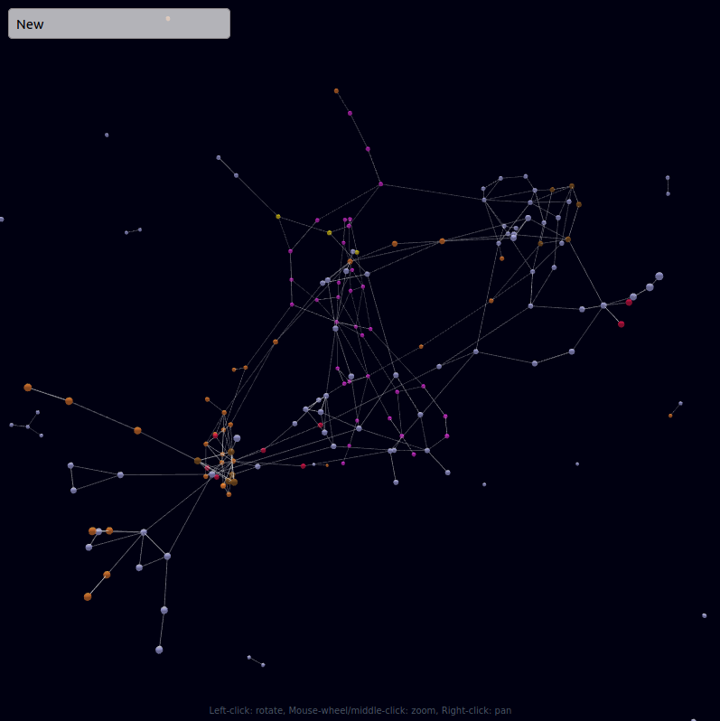
It was the fated day of 20-08-2020 when vv got merged. It was finally time to analyze the graph formed from the union of space-weather and telemetry in Polaris with the power bestowed upon me by the maintainers. And what a beauty she was -

There were a lot of interesting observations we were able to make: (This is an actual excerpt from the message I had sent that day):
- Only 4 major parameters of the telemetry depend on the space_weather:
- Camera (because they avoided taking images when there was a lot of sunspots?)
- Bus Voltage (3V) (obvious)
- Boot time (why?)
- Few temperature readings (obvious again)
- The telemetry is independent of position (r) and velocity (v) (coz sun synchronous?)
- Space weather parameters seem to cluster on one side of the graph and on-board sensors (for magnetometer and others) cluster on the other side
This probably means that the satellite is well designed and (for the most part) is resistant to space-weather.
All of this is from a layman’s perspective. I am sure the satellite operators will be able to read much more into the graph. It just goes to show the power of such a measuring tool!
Reading the graph is pretty easy. You can follow along at http://deepchaos.space. (At the time of writing, space weather had not been added to the graph but is expected to be pushed soon)

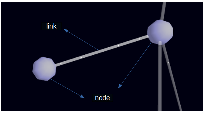
- Each white/lavender dot is a node. It represents telemetry/space weather
- Each line between two nodes is a link and the speed of the moving dot inside this link represents the strength of the connection (Faster => High relation)
- You can zoom using the scroll, pan using right click and spin with left click
- The box on the top left corner helps search for stuff
- If you type the name of the telemetry data and press enter, you will be jetpacked to the node
- If you type a part of the name and click “Ctrl + Enter”, all matching nodes will be highlighted
- (Once the website is updated with the upstream commits) The colors you set will be retained and you can press “Ctrl + Shift + Enter” to reset it.
- You now know everything you need to start using the graph xD
So what we learnt was about a “new” type of graph not:
- the stonks one:

- or the not-stonks one:

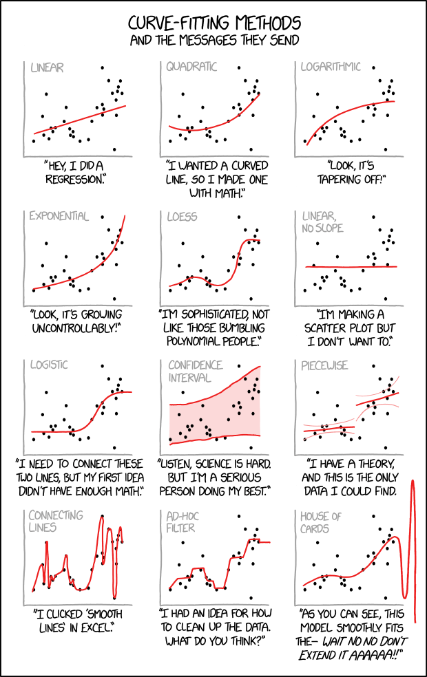
- or any of these:

but the polaris one :D